Q.What is Bootstrap ?

Bootstrap is a very common framework used for Front-End Development.
Q. What is Framework ?
A basic conceptional structure, it differs from libraries due to certain key points.
- Inversion of Control
- Default Behavior
- Extensibility
- Non-modifiable Framework Code
A large part of Bootstrap is not memorization but really understanding how to reference the documentation for your own use cases. Please keep referring the Bootstrap documents for help.
Now there are a lot of differences between bootstrap 3 and bootstrap 4, for further information, https://blog.templatetoaster.com/bootstrap-3-vs-bootstrap-4-migrate-differences/

To use bootstrap, you have to go to, https://getbootstrap.com/docs/3.3/getting-started/.
There are multiple ways to use Bootstrap
- Download the source code itself of bootstrap
- Use CDN, just like google font. To link Bootstrap with our HTML file.
Bootstrap has a lot of templates to use, for more templates go to example in https://getbootstrap.com/docs/3.3/getting-started/#template
For more details on particular component of the template, https://getbootstrap.com/docs/3.3/components/
Q.How to connect a HTML file to Bootstrap file ?
The folks over at MaxCDN graciously provide CDN support for Bootstrap’s CSS and JavaScript. Just use these Bootstrap CDN links.
<!-- Latest compiled and minified CSS -->
<link rel="stylesheet" href="https://maxcdn.bootstrapcdn.com/bootstrap/3.3.7/css/bootstrap.min.css" integrity="sha384-BVYiiSIFeK1dGmJRAkycuHAHRg32OmUcww7on3RYdg4Va+PmSTsz/K68vbdEjh4u" crossorigin="anonymous">
You will need internet connection for it.
Essential parts of a Bootstrap code :
1.Container class : A default class, it is used to effect margin spacing.
<div class="container">
      <h1>Hello World!</h1>
</div>
2.Button tags : You can search button in, https://getbootstrap.com/docs/3.3/css/#buttons.
This will not be that effective until and unless we know, java script.
<a class="btn btn-default" href="#" role="button">Link</a>
We can change the color and size of the button, or make it in active or disabled state. You can always override the default class by using class option in CSS file.
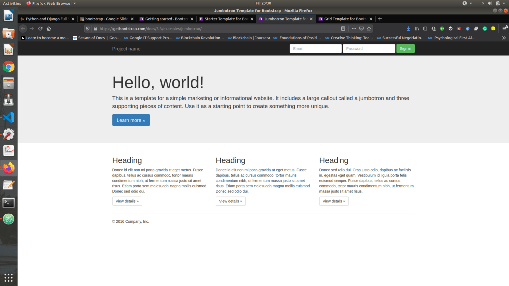
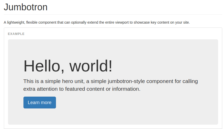
3.Jumbo tron Component : A lightweight, flexible component that can optionally extend the entire view port to showcase key content on your site.
<div class="jumbotron">
  <div class="container">
     <h1>Hello, world!</h1>

     <p><a class="btn btn-primary btn-lg" href="#" role="button">Learn more</a></p>

  </div>
</div>
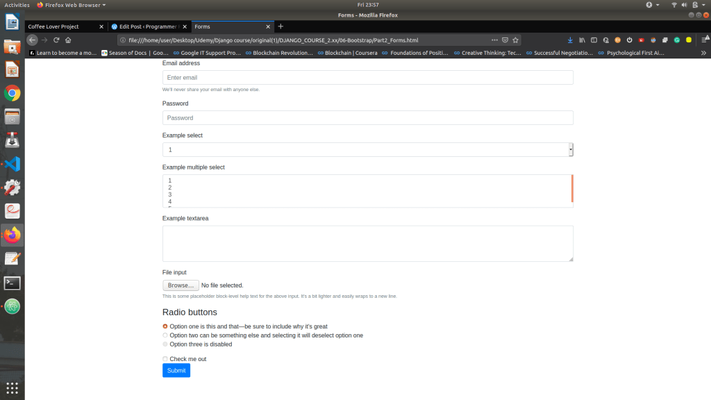
Forms : Individual form controls automatically receive some global styling.
Search Forms in https://getbootstrap.com/docs/3.3/css/#forms.
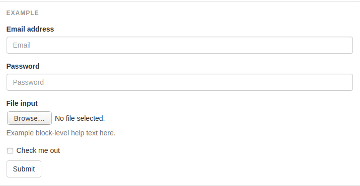
- class form-group : puts spacing between components/blocks of Forms.
- class form-control: It’s rounding the corner and moving it to next line.

You can use Drop down or input or text or File or Radio button are in Bootstrap.
Navigation bar or Navbar :
Navbars are responsive meta components that serve as navigation headers for your application or site. They begin collapsed (and are toggleable) in mobile views and become horizontal as the available viewport width increases.
Search Navbar on https://getbootstrap.com/docs/3.3/components/#navbar.
1.To fix the navbar at the top
<nav class="navbar navbar-fixed-top">
2.To inverse the color of Navbar
<nav class="navbar navbar-inverse ">
3.Hamburger Collapse button :
<div class="collapse navbar-collapse" id="bs-example-navbar-collapse-1">
For Hamburger collapse drop down button to work we need to use j query and java script.

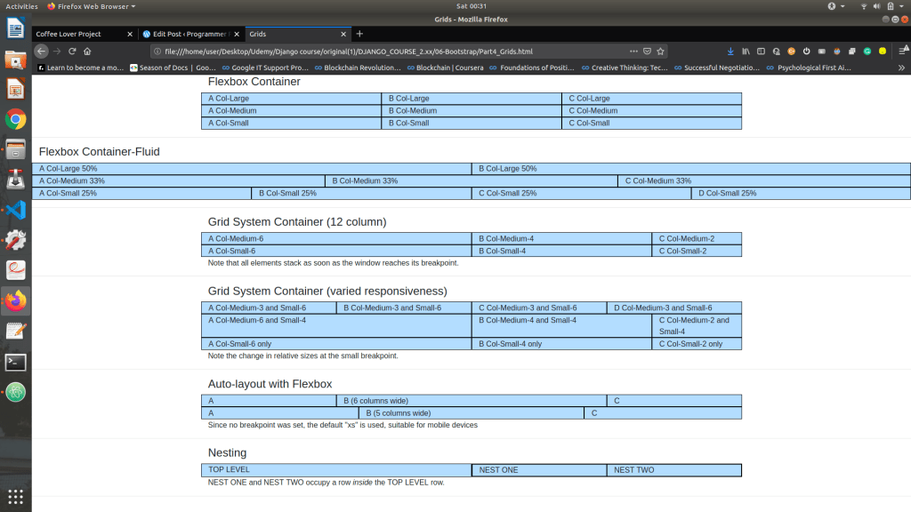
4.Grid view :
We split the entire screen into 12 basic available columns, we then split them according to the screen size of the device.
Inside of a row class, we have col – Screen Size – number of columns. For example,
col-md-6 : It means when we there is a medium screen i want this class to take up 6 pixels or half of the screen.
<div class="row">
        <div class="col-lg boxy" >A Col-Large</div>
        <div class="col-lg boxy" >B Col-Large</div>
        <div class="col-lg boxy" >C Col-Large</div>
      </div>
If we have to change the size of the browser then, we can have two parameters for the size of the screen.
<div class="row">
        <div class="col-md-3 col-sm-6 boxy" >A Col-Medium-3 and Small-6</div>
        <div class="col-md-3 col-sm-6 boxy" >B Col-Medium-3 and Small-6</div>
        <div class="col-md-3 col-sm-6 boxy" >C Col-Medium-3 and Small-6</div>
        <div class="col-md-3 col-sm-6 boxy" >D Col-Medium-3 and Small-6</div>
      </div>
You have various options to modify the grid view, learn more on https://getbootstrap.com/docs/3.4/examples/grid/
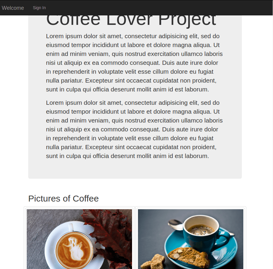
Now after all this knowledge you could create a Coffee project, which should look like this

Then using grid layout in Bootstrap, the result should be.
Useful links to further learn from,
- https://www.w3schools.com/
- https://developer.mozilla.org/en-US/
- https://www.slideshare.net/100002045683871/intro-to-web-dev-235572016?qid=42ae46b7-594a-4b3f-b192-c42d5e769d67&v=&b=&from_search=4
- https://getbootstrap.com/docs/3.3/https://getbootstrap.com/docs/3.3/
Next Blog contains JavaScript : https://programmerprodigy.code.blog/2020/06/24/javascript-basics-for-web-development/
GitHub Link to check the basic source code : https://github.com/kakabisht/Web-Dev-Blog-UI.


 Programmer Prodigy
Amazingly explained!!
LikeLike